Web Design For The Modern World
Websites are the most effective piece of advertising that your nonprofit has complete ownership of. It’s how you present the organization’s brand, personality, and mission while highlighting what sets you apart from the competition.
The Internet as a whole, including the methods in which information is displayed and shared, is changing. One definition of a website is “a collection of individual documents and files made up of text, graphics, colors, links, and formatting that come together to create a complete user experience.” But as the Internet progresses, so should the user’s experience of it.
The journey through websites is currently through something called a sitemap. Sitemaps illustrate the navigation of individual pages, documents and files on a website. Because of this, when visiting a website, the user typically is forced to choose where to go in order to get the information they’re searching for. But as the internet progresses over time, the user’s experience should change with it. Nowadays, websites should function like stories, and there should never be a moment when a site visitor is between pages. The use of individual pages to divide up a website is starting to become outdated, and consequentially, sitemaps are slowly being replaced by what are known as site ‘storylines.’
Let us explain this a bit further…
Storylines describe the basic flow of a website’s content without breaking down each component into individual pages. Websites should communicate their content in a way that flows naturally for the viewer, preventing them from getting “lost” or feeling unsatisfied by what the site has to offer. Collections of pages with content should be combined to form one single page that can be navigated easily.
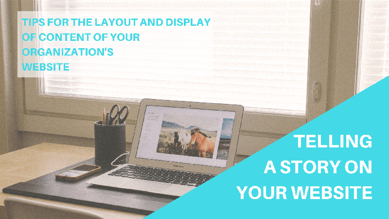
Similar to a slide-show presentation you might show to a board of directors, your website should feel like a presentation to potential donors, volunteers, and other site visitors. The home page (think of this like your “title” slide) should be an introduction of your nonprofit. From there, you should present your mission along with the key elements of your organization, and conclude with a clear call-to-action. Think of your website content like a story. What are the most important parts? How do you want your story to flow?
The content of your site should automatically load as visitors scroll through the page. Think of Facebook’s Timeline: as you scroll down the page, Facebook automatically loads more and more content. Your website should be tree-like, with more information branching out from main points when either clicked or moused over.
A website titled, Startups, This Is How Design Works is a great example of how to present information. The table of contents always appears at the top of the page for simple, straight-forward navigation. Throughout the site, visitors can click on and mouse over icons to display more inform ation. By requiring someone to perform an action (like clicking) in order to see additional information, you’re keeping the page clean, and preventing clutter. The best part about this example is that when a graphic is clicked or moused over, the additional displayed information can be read by any search engine, which can improve your overall search engine ranking without cluttering your site and confusing your visitors.
Good storytelling doesn’t have to be obvious. Often times the greatest stories can be told in the smallest details. If your organization has passion combined with an important mission, take the time to let that reflect on your website. By telling your audience the story of your nonprofit in an organized, modern way, you’ll be more likely to see positive feedback that could result in more donations, volunteers, sign-ups, etc.
If you have any questions about user experience, web design, or content creation, contact us!
By: Katie Kelderman, Social Media Strategist